创建一个屏幕
编辑
在本教程中,了解如何使用 React Native 的 Pressable 和 Expo Image 等组件构建一个屏幕。
在本章中,我们将创建 StickerSmash 应用的第一个屏幕。
上面的屏幕显示了一张图片和两个按钮。应用用户可以通过两个按钮中的一个选择一张图片。第一个按钮允许用户从他们的设备中选择一张图片。第二个按钮允许用户继续使用应用提供的默认图片。
一旦用户选择了一张图片,他们可以在其上添加贴纸。所以,让我们开始创建这个屏幕。
1
2
显示图片
我们将使用 expo-image 库在应用中显示图片。它提供了一个跨平台的 <Image> 组件来加载和渲染一张图片。
通过在终端中按 Ctrl + c 停止开发服务器。然后,安装 expo-image 库:
- npx expo install expo-imagenpx expo install 命令将安装该库并将其添加到 package.json 的项目依赖中。
提示: 每当我们在项目中安装新库时,通过在终端中按 Ctrl + c 停止开发服务器,然后运行安装命令。在安装完成后,我们可以通过在同一个终端窗口中运行npx expo start来再次启动开发服务器。
Image 组件将图片的来源作为其值。来源可以是 静态资产 或一个 URL。例如,来自 assets/images 目录的来源是静态的。它也可以来自 网络 作为 uri 属性。
要在 app/(tabs)/index.tsx 文件中使用 Image 组件:
- 从
expo-image库中导入Image。 - 创建一个
PlaceholderImage变量以便在Image组件中使用 assets/images/background-image.png 文件作为source属性。
import { View, StyleSheet } from 'react-native';
import { Image } from 'expo-image';

const PlaceholderImage = require('@/assets/images/background-image.png');

export default function Index() {
  return (
    <View style={styles.container}>
      <View style={styles.imageContainer}>
        <Image source={PlaceholderImage} style={styles.image} />
      </View>
    </View>
  );
}

const styles = StyleSheet.create({
  container: {
    flex: 1,
    backgroundColor: '#25292e',
    alignItems: 'center',
  },
  imageContainer: {
    flex: 1,
  },
  image: {
    width: 320,
    height: 440,
    borderRadius: 18,
  },
});
3
将组件分割到文件中
随着我们向这个屏幕添加更多组件,让我们将代码分割到多个文件中。在本教程中,我们将使用组件目录来创建自定义组件。
- 创建一个顶级 components 目录,并在其中创建 ImageViewer.tsx 文件。
- 将显示该图像的代码与
image样式一起移动到该文件中。
import { ImageSourcePropType, StyleSheet } from 'react-native';
import { Image } from 'expo-image';

type Props = {
  imgSource: ImageSourcePropType;
};

export default function ImageViewer({ imgSource }: Props) {
  return <Image source={imgSource} style={styles.image} />;
}

const styles = StyleSheet.create({
  image: {
    width: 320,
    height: 440,
    borderRadius: 18,
  },
});
因为 ImageViewer 是一个自定义组件,我们将其放在一个独立的目录中,而不是 app 目录中。每个文件都在 app 目录中,要么是布局文件,要么是路由文件。更多信息,请参见 非导航组件位于 app 目录之外。
导入 ImageViewer 并在 app/(tabs)/index.tsx 中使用它:
import { StyleSheet, View } from 'react-native';

import ImageViewer from '@/components/ImageViewer';

const PlaceholderImage = require('@/assets/images/background-image.png');

export default function Index() {
  return (
    <View style={styles.container}>
      <View style={styles.imageContainer}>
        <ImageViewer imgSource={PlaceholderImage} />
      </View>
    </View>
  );
}

const styles = StyleSheet.create({
  container: {
    flex: 1,
    backgroundColor: '#25292e',
    alignItems: 'center',
  },
  imageContainer: {
    flex: 1,
  },
});
什么是导入语句中的 @?
@ 符号是一个自定义 路径别名,用来导入自定义组件和其他模块,而不是相对路径。Expo CLI 会自动在 tsconfig.json 中配置它。
4
使用 Pressable 创建按钮
React Native 包含几个不同的组件来处理触摸事件,但推荐使用 <Pressable>,因为它的灵活性。它可以检测单击、长按,在按钮按下和释放时触发不同事件,等等。
在设计中,我们需要创建两个按钮。每个按钮都有不同的样式和标签。让我们首先为这些按钮创建一个可重用的组件。在 components 目录中创建一个 Button.tsx 文件,内容如下:
import { StyleSheet, View, Pressable, Text } from 'react-native';

type Props = {
  label: string;
};

export default function Button({ label }: Props) {
  return (
    <View style={styles.buttonContainer}>
      <Pressable style={styles.button} onPress={() => alert('You pressed a button.')}>
        <Text style={styles.buttonLabel}>{label}</Text>
      </Pressable>
    </View>
  );
}

const styles = StyleSheet.create({
  buttonContainer: {
    width: 320,
    height: 68,
    marginHorizontal: 20,
    alignItems: 'center',
    justifyContent: 'center',
    padding: 3,
  },
  button: {
    borderRadius: 10,
    width: '100%',
    height: '100%',
    alignItems: 'center',
    justifyContent: 'center',
    flexDirection: 'row',
  },
  buttonLabel: {
    color: '#fff',
    fontSize: 16,
  },
});
当用户点击屏幕上的任何按钮时,应用会显示一个警告。这是因为 <Pressable> 在其 onPress 属性中调用了 alert()。让我们将这个组件导入到 app/(tabs)/index.tsx 文件中,并为包含这些按钮的 <View> 添加样式:
import { View, StyleSheet } from 'react-native';

import Button from '@/components/Button';
import ImageViewer from '@/components/ImageViewer';

const PlaceholderImage = require("@/assets/images/background-image.png");

export default function Index() {
  return (
    <View style={styles.container}>
      <View style={styles.imageContainer}>
        <ImageViewer imgSource={PlaceholderImage} />
      </View>
      <View style={styles.footerContainer}>
        <Button label="Choose a photo" />
        <Button label="Use this photo" />
      </View>
    </View>
  );
}

const styles = StyleSheet.create({
  container: {
    flex: 1,
    backgroundColor: '#25292e',
    alignItems: 'center',
  },
  imageContainer: {
    flex: 1,
    paddingTop: 28,
  },
  footerContainer: {
    flex: 1 / 3,
    alignItems: 'center',
  },
});
让我们看看我们的应用在 Android、iOS 和网页上的效果:
标签为 "使用这张照片" 的第二个按钮类似于设计中的实际按钮。然而,第一个按钮需要更多的样式来匹配设计。
5
增强可重用的按钮组件
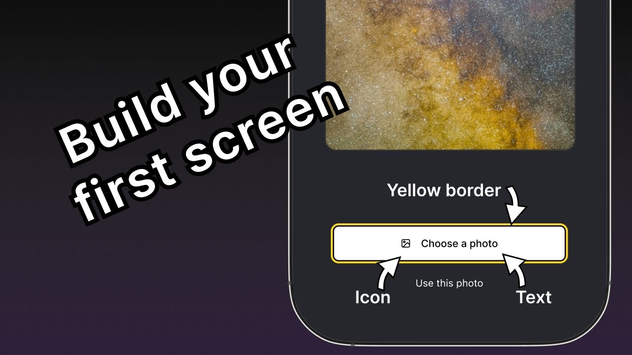
"选择照片" 按钮需要与 "使用这张照片" 按钮不同的样式,所以我们将添加一个新的按钮主题属性,使其能够应用 primary 主题。这个按钮在标签前面还有一个图标。我们将使用来自 @expo/vector-icons 库的图标。
为了加载并显示按钮上的图标,让我们使用库中的 FontAwesome。修改 components/Button.tsx 文件以添加以下代码片段:
import { StyleSheet, View, Pressable, Text } from 'react-native';
import FontAwesome from '@expo/vector-icons/FontAwesome';

type Props = {
  label: string;
  theme?: 'primary';
};

export default function Button({ label, theme }: Props) {
  if (theme === 'primary') {
  return (
      <View
        style={[
          styles.buttonContainer,
          { borderWidth: 4, borderColor: '#ffd33d', borderRadius: 18 },
        ]}>
        <Pressable
          style={[styles.button, { backgroundColor: '#fff' }]}
          onPress={() => alert('You pressed a button.')}>
          <FontAwesome name="picture-o" size={18} color="#25292e" style={styles.buttonIcon} />
          <Text style={[styles.buttonLabel, { color: '#25292e' }]}>{label}</Text>
        </Pressable>
      </View>
    );
  }

  return (
    <View style={styles.buttonContainer}>
      <Pressable style={styles.button} onPress={() => alert('You pressed a button.')}>
        <Text style={styles.buttonLabel}>{label}</Text>
      </Pressable>
    </View>
  );
}

const styles = StyleSheet.create({
  buttonContainer: {
    width: 320,
    height: 68,
    marginHorizontal: 20,
    alignItems: 'center',
    justifyContent: 'center',
    padding: 3,
  },
  button: {
    borderRadius: 10,
    width: '100%',
    height: '100%',
    alignItems: 'center',
    justifyContent: 'center',
    flexDirection: 'row',
  },
  buttonIcon: {
    paddingRight: 8,
  },
  buttonLabel: {
    color: '#fff',
    fontSize: 16,
  },
});
让我们了解一下上述代码的作用:
- 主要主题按钮使用 内联样式,这会覆盖使用
StyleSheet.create()定义的样式,并直接将对象传递给style属性。 - 主要主题中的
<Pressable>组件使用backgroundColor属性,其值为#fff来将按钮的背景设置为白色。如果我们将此属性添加到styles.button,则背景颜色值将同时应用于主要主题和未样式化的按钮。 - 内联样式使用 JavaScript,并为特定值覆盖默认样式。
现在,修改 app/(tabs)/index.tsx 文件,以便在第一个按钮上使用 theme="primary" 属性。
import { View, StyleSheet } from 'react-native';

import Button from '@/components/Button';
import ImageViewer from '@/components/ImageViewer';

const PlaceholderImage = require('@/assets/images/background-image.png');

export default function Index() {
  return (
    <View style={styles.container}>
      <View style={styles.imageContainer}>
        <ImageViewer imgSource={PlaceholderImage} />
      </View>
      <View style={styles.footerContainer}>
        <Button theme="primary" label="Choose a photo" />
        <Button label="Use this photo" />
      </View>
    </View>
  );
}

const styles = StyleSheet.create({
  container: {
    flex: 1,
    backgroundColor: '#25292e',
    alignItems: 'center',
  },
  imageContainer: {
    flex: 1,
  },
  footerContainer: {
    flex: 1 / 3,
    alignItems: 'center',
  },
});
让我们看看我们的应用在 Android、iOS 和网页上的效果:
小结
第三章:构建一个屏幕
我们已经成功实现了初始设计,以开始构建我们应用的第一个屏幕。
在下一章中,我们将添加从设备媒体库中选择图像的功能。