创建模态框
编辑
在本教程中,学习如何创建一个 React Native 模态框以选择图像。
React Native 提供了一个 <Modal> 组件,可以在应用程序的其余部分上显示内容。一般来说,模态框用于吸引用户注意关键的信息或引导他们采取行动。例如,在 第三章 中,按下按钮后,我们使用 alert() 显示了一些占位符文本。这就是模态组件显示覆盖层的方式。
在本章中,我们将创建一个显示表情符号选择器列表的模态框。
1
声明一个状态变量以显示按钮
在实现模态框之前,我们将添加三个新按钮。这些按钮在用户从媒体库中选择图像或使用占位符图像后可见。其中一个按钮将触发表情符号选择器模态框。
在 app/(tabs)/index.tsx 中:
- 声明一个布尔状态变量
showAppOptions,用于显示或隐藏打开模态的按钮,以及一些其他选项。当应用程序屏幕加载时,我们将其设置为false,这样在选择图像之前不会显示选项。当用户选择图像或使用占位符图像时,我们将其设置为true。 - 更新
pickImageAsync()函数,在用户选择图像后将showAppOptions的值设置为true。 - 更新没有主题的按钮,添加一个
onPress属性,值如下。
import { View, StyleSheet } from 'react-native';
import * as ImagePicker from 'expo-image-picker';
import { useState } from 'react';

import Button from '@/components/Button';
import ImageViewer from '@/components/ImageViewer';

const PlaceholderImage = require('@/assets/images/background-image.png');

export default function Index() {
  const [selectedImage, setSelectedImage] = useState<string | undefined>(undefined);
  const [showAppOptions, setShowAppOptions] = useState<boolean>(false);

  const pickImageAsync = async () => {
    let result = await ImagePicker.launchImageLibraryAsync({
      mediaTypes: ['images'],
      allowsEditing: true,
      quality: 1,
    });

    if (!result.canceled) {
      setSelectedImage(result.assets[0].uri);
      setShowAppOptions(true);
    } else {
      alert('You did not select any image.');
    }
  };

  return (
    <View style={styles.container}>
      <View style={styles.imageContainer}>
        <ImageViewer imgSource={PlaceholderImage} selectedImage={selectedImage} />
      </View>
      {showAppOptions ? (
        <View />
      ) : (
        <View style={styles.footerContainer}>
          <Button theme="primary" label="Choose a photo" onPress={pickImageAsync} />
          <Button label="Use this photo" onPress={() => setShowAppOptions(true)} />
        </View>
      )}
    </View>
  );
}

const styles = StyleSheet.create({
  container: {
    flex: 1,
    backgroundColor: '#25292e',
    alignItems: 'center',
  },
  imageContainer: {
    flex: 1,
  },
  footerContainer: {
    flex: 1 / 3,
    alignItems: 'center',
  },
});
在上述代码片段中,我们根据 showAppOptions 的值渲染 Button 组件,并将按钮移到三元运算符块中。当 showAppOptions 的值为 true 时,渲染一个空的 <View> 组件。我们将在下一步中处理此状态。
现在,我们可以移除 Button 组件上的 alert,并在 components/Button.tsx 中更新第二个按钮的 onPress 属性:
<Pressable style={styles.button} onPress={onPress}>
2
添加按钮
让我们分解本章将实现的选项按钮的布局。设计如下:
它包含一个父 <View>,其中有三个按钮并排对齐。中间的按钮带有加号图标 (+),将打开模态框,并且样式与其他两个按钮不同。
在 components 目录下,创建一个新的 CircleButton.tsx 文件,添加以下代码:
import { View, Pressable, StyleSheet } from 'react-native';
import MaterialIcons from '@expo/vector-icons/MaterialIcons';

type Props = {
  onPress: () => void;
};

export default function CircleButton({ onPress }: Props) {
  return (
    <View style={styles.circleButtonContainer}>
      <Pressable style={styles.circleButton} onPress={onPress}>
        <MaterialIcons name="add" size={38} color="#25292e" />
      </Pressable>
    </View>
  );
}

const styles = StyleSheet.create({
  circleButtonContainer: {
    width: 84,
    height: 84,
    marginHorizontal: 60,
    borderWidth: 4,
    borderColor: '#ffd33d',
    borderRadius: 42,
    padding: 3,
  },
  circleButton: {
    flex: 1,
    justifyContent: 'center',
    alignItems: 'center',
    borderRadius: 42,
    backgroundColor: '#fff',
  },
});
为了渲染加号图标,此按钮使用 @expo/vector-icons 库中的 <MaterialIcons> 图标集。
其他两个按钮也使用 <MaterialIcons> 来显示垂直对齐的文本标签和图标。在 components 目录中创建一个名为 IconButton.tsx 的文件。这个组件接受三个属性:
icon: 对应于MaterialIcons库图标的名称。label: 显示在按钮上的文本标签。onPress: 当用户按下按钮时调用的函数。
import { Pressable, StyleSheet, Text } from 'react-native';
import MaterialIcons from '@expo/vector-icons/MaterialIcons';

type Props = {
  icon: keyof typeof MaterialIcons.glyphMap;
  label: string;
  onPress: () => void;
};

export default function IconButton({ icon, label, onPress }: Props) {
  return (
    <Pressable style={styles.iconButton} onPress={onPress}>
      <MaterialIcons name={icon} size={24} color="#fff" />
      <Text style={styles.iconButtonLabel}>{label}</Text>
    </Pressable>
  );
}

const styles = StyleSheet.create({
  iconButton: {
    justifyContent: 'center',
    alignItems: 'center',
  },
  iconButtonLabel: {
    color: '#fff',
    marginTop: 12,
  },
});
在 app/(tabs)/index.tsx 中:
- 导入
CircleButton和IconButton组件以显示它们。 - 为这些按钮添加三个占位符函数。
onReset()函数在用户按下重置按钮时调用,使图像选择按钮再次出现。我们稍后将为其他两个函数添加功能。
import { View, StyleSheet } from 'react-native';
import * as ImagePicker from 'expo-image-picker';
import { useState } from 'react';

import Button from '@/components/Button';
import ImageViewer from '@/components/ImageViewer';
import IconButton from '@/components/IconButton';
import CircleButton from '@/components/CircleButton';

const PlaceholderImage = require('@/assets/images/background-image.png');

export default function Index() {
  const [selectedImage, setSelectedImage] = useState<string | undefined>(undefined);
  const [showAppOptions, setShowAppOptions] = useState<boolean>(false);

  const pickImageAsync = async () => {
    let result = await ImagePicker.launchImageLibraryAsync({
      mediaTypes: ['images'],
      allowsEditing: true,
      quality: 1,
    });

    if (!result.canceled) {
      setSelectedImage(result.assets[0].uri);
      setShowAppOptions(true);
    } else {
      alert('You did not select any image.');
    }
  };

  const onReset = () => {
    setShowAppOptions(false);
  };

  const onAddSticker = () => {
    // 我们稍后将实现这一点
  };

  const onSaveImageAsync = async () => {
    // 我们稍后将实现这一点
  };

  return (
    <View style={styles.container}>
      <View style={styles.imageContainer}>
        <ImageViewer imgSource={PlaceholderImage} selectedImage={selectedImage} />
      </View>
      {showAppOptions ? (
        <View style={styles.optionsContainer}>
          <View style={styles.optionsRow}>
            <IconButton icon="refresh" label="Reset" onPress={onReset} />
            <CircleButton onPress={onAddSticker} />
            <IconButton icon="save-alt" label="Save" onPress={onSaveImageAsync} />
          </View>
        </View>
      ) : (
        <View style={styles.footerContainer}>
          <Button theme="primary" label="Choose a photo" onPress={pickImageAsync} />
          <Button label="Use this photo" onPress={() => setShowAppOptions(true)} />
        </View>
      )}
    </View>
  );
}

const styles = StyleSheet.create({
  container: {
    flex: 1,
    backgroundColor: '#25292e',
    alignItems: 'center',
  },
  imageContainer: {
    flex: 1,
  },
  footerContainer: {
    flex: 1 / 3,
    alignItems: 'center',
  },
  optionsContainer: {
    position: 'absolute',
    bottom: 80,
  },
  optionsRow: {
    alignItems: 'center',
    flexDirection: 'row',
  },
});
让我们看看我们的应用程序在 Android、iOS 和网络上的表现:
3
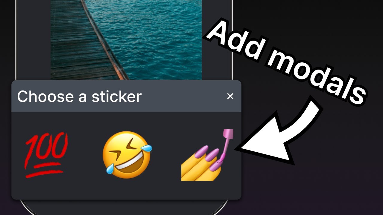
创建表情符号选择器模态框
模态框允许用户从可用表情符号列表中选择一个表情符号。在 components 目录中创建一个 EmojiPicker.tsx 文件。这个组件接受三个属性:
isVisible: 一个布尔值,用于确定模态框的可见状态。onClose: 关闭模态框的函数。children: 稍后用于显示表情符号列表。
import { Modal, View, Text, Pressable, StyleSheet } from 'react-native';
import { PropsWithChildren } from 'react';
import MaterialIcons from '@expo/vector-icons/MaterialIcons';

type Props = PropsWithChildren<{
  isVisible: boolean;
  onClose: () => void;
}>;

export default function EmojiPicker({ isVisible, children, onClose }: Props) {
  return (
    <View>
    <Modal animationType="slide" transparent={true} visible={isVisible}>
      <View style={styles.modalContent}>
        <View style={styles.titleContainer}>
          <Text style={styles.title}>Choose a sticker</Text>
          <Pressable onPress={onClose}>
            <MaterialIcons name="close" color="#fff" size={22} />
          </Pressable>
        </View>
        {children}
      </View>
    </Modal>
    </View>
  );
}

const styles = StyleSheet.create({
  modalContent: {
    height: '25%',
    width: '100%',
    backgroundColor: '#25292e',
    borderTopRightRadius: 18,
    borderTopLeftRadius: 18,
    position: 'absolute',
    bottom: 0,
  },
  titleContainer: {
    height: '16%',
    backgroundColor: '#464C55',
    borderTopRightRadius: 10,
    borderTopLeftRadius: 10,
    paddingHorizontal: 20,
    flexDirection: 'row',
    alignItems: 'center',
    justifyContent: 'space-between',
  },
  title: {
    color: '#fff',
    fontSize: 16,
  },
});
让我们了解上述代码的作用:
<Modal>组件显示一个标题和一个关闭按钮。- 它的
visible属性取isVisible的值,并控制模态框是打开还是关闭。 - 它的
transparent属性是一个布尔值,用于确定模态框是否填充整个视图。 - 它的
animationType属性确定它如何进入和离开屏幕。在这种情况下,它是从屏幕底部滑动。 - 最后,当用户按下关闭的
<Pressable>时,<EmojiPicker>调用onClose属性。
现在,让我们修改 app/(tabs)/index.tsx:
- 导入
<EmojiPicker>组件。 - 创建一个
isModalVisible状态变量,使用useState钩子,其默认值为false,在用户按下按钮以打开它之前隐藏模态框。 - 在
onAddSticker()函数中替换备注,更新isModalVisible变量为true,当用户按下按钮时。这将打开表情符号选择器。 - 创建
onModalClose()函数以更新isModalVisible状态变量。 - 将
<EmojiPicker>组件放置在Index组件的底部。
import { View, StyleSheet } from 'react-native';
import * as ImagePicker from 'expo-image-picker';
import { useState } from 'react';

import Button from '@/components/Button';
import ImageViewer from '@/components/ImageViewer';
import IconButton from '@/components/IconButton';
import CircleButton from '@/components/CircleButton';
import EmojiPicker from '@/components/EmojiPicker';

const PlaceholderImage = require('@/assets/images/background-image.png');

export default function Index() {
  const [selectedImage, setSelectedImage] = useState<string | undefined>(undefined);
  const [showAppOptions, setShowAppOptions] = useState<boolean>(false);
  const [isModalVisible, setIsModalVisible] = useState<boolean>(false);

  const pickImageAsync = async () => {
    let result = await ImagePicker.launchImageLibraryAsync({
      mediaTypes: ['images'],
      allowsEditing: true,
      quality: 1,
    });

    if (!result.canceled) {
      setSelectedImage(result.assets[0].uri);
      setShowAppOptions(true);
    } else {
      alert('You did not select any image.');
    }
  };

  const onReset = () => {
    setShowAppOptions(false);
  };

  const onAddSticker = () => {
    setIsModalVisible(true);
  };

  const onModalClose = () => {
    setIsModalVisible(false);
  };

  const onSaveImageAsync = async () => {
    // 我们稍后将实现这一点
  };

  return (
    <View style={styles.container}>
      <View style={styles.imageContainer}>
        <ImageViewer imgSource={PlaceholderImage} selectedImage={selectedImage} />
      </View>
      {showAppOptions ? (
        <View style={styles.optionsContainer}>
          <View style={styles.optionsRow}>
            <IconButton icon="refresh" label="Reset" onPress={onReset} />
            <CircleButton onPress={onAddSticker} />
            <IconButton icon="save-alt" label="Save" onPress={onSaveImageAsync} />
          </View>
        </View>
      ) : (
        <View style={styles.footerContainer}>
          <Button theme="primary" label="Choose a photo" onPress={pickImageAsync} />
          <Button label="Use this photo" onPress={() => setShowAppOptions(true)} />
        </View>
      )}
      <EmojiPicker isVisible={isModalVisible} onClose={onModalClose}>
        {/* Emoji list component will go here */}
      </EmojiPicker>
    </View>
  );
}

const styles = StyleSheet.create({
  container: {
    flex: 1,
    backgroundColor: '#25292e',
    alignItems: 'center',
  },
  imageContainer: {
    flex: 1,
  },
  footerContainer: {
    flex: 1 / 3,
    alignItems: 'center',
  },
  optionsContainer: {
    position: 'absolute',
    bottom: 80,
  },
  optionsRow: {
    alignItems: 'center',
    flexDirection: 'row',
  },
});
这是此步骤后的结果:
4
显示表情符号列表
让我们在模态框的内容中添加一个水平的表情符号列表。我们将使用 <FlatList> 组件来实现它。
在 components 目录中创建一个 EmojiList.tsx 文件,并添加以下代码:
import { useState } from 'react';
import { ImageSourcePropType, StyleSheet, FlatList, Platform, Pressable } from 'react-native';
import { Image } from 'expo-image';

type Props = {
  onSelect: (image: ImageSourcePropType) => void;
  onCloseModal: () => void;
};

export default function EmojiList({ onSelect, onCloseModal }: Props) {
  const [emoji] = useState<ImageSourcePropType[]>([
    require("../assets/images/emoji1.png"),
    require("../assets/images/emoji2.png"),
    require("../assets/images/emoji3.png"),
    require("../assets/images/emoji4.png"),
    require("../assets/images/emoji5.png"),
    require("../assets/images/emoji6.png"),
  ]);

  return (
    <FlatList
      horizontal
      showsHorizontalScrollIndicator={Platform.OS === 'web'}
      data={emoji}
      contentContainerStyle={styles.listContainer}
      renderItem={({ item, index }) => (
        <Pressable
          onPress={() => {
            onSelect(item);
            onCloseModal();
          }}>
          <Image source={item} key={index} style={styles.image} />
        </Pressable>
      )}
    />
  );
}

const styles = StyleSheet.create({
  listContainer: {
    borderTopRightRadius: 10,
    borderTopLeftRadius: 10,
    paddingHorizontal: 20,
    flexDirection: 'row',
    alignItems: 'center',
    justifyContent: 'space-between',
  },
  image: {
    width: 100,
    height: 100,
    marginRight: 20,
  },
});
让我们了解上述代码的作用:
- 上述
<FlatList>组件使用Image组件渲染所有表情符号图像,并包裹在一个<Pressable>中。稍后,我们将改进它,以便用户可以点击屏幕上的表情符号,使其作为贴纸出现在图像上。 - 它还使用
emoji数组变量提供的项数组作为data属性的值。renderItem属性从data中获取项,并返回列表中的项。最后,我们添加Image和<Pressable>组件以显示此项。 horizontal属性使列表水平渲染,而不是垂直渲染。showsHorizontalScrollIndicator使用 React Native 的Platform模块检查值并在网络上显示水平滚动条。
现在,更新 app/(tabs)/index.tsx 以导入 <EmojiList> 组件,并用以下代码片段替换 <EmojiPicker> 组件内的注释:
import { ImageSourcePropType, View, StyleSheet } from 'react-native';
import * as ImagePicker from 'expo-image-picker';
import { useState } from 'react';

import Button from '@/components/Button';
import ImageViewer from '@/components/ImageViewer';
import IconButton from '@/components/IconButton';
import CircleButton from '@/components/CircleButton';
import EmojiPicker from '@/components/EmojiPicker';
import EmojiList from '@/components/EmojiList';

const PlaceholderImage = require('@/assets/images/background-image.png');

export default function Index() {
  const [selectedImage, setSelectedImage] = useState<string | undefined>(undefined);
  const [showAppOptions, setShowAppOptions] = useState<boolean>(false);
  const [isModalVisible, setIsModalVisible] = useState<boolean>(false);
  const [pickedEmoji, setPickedEmoji] = useState<ImageSourcePropType | undefined>(undefined);

  const pickImageAsync = async () => {
    let result = await ImagePicker.launchImageLibraryAsync({
      mediaTypes: ['images'],
      allowsEditing: true,
      quality: 1,
    });

    if (!result.canceled) {
      setSelectedImage(result.assets[0].uri);
      setShowAppOptions(true);
    } else {
      alert('You did not select any image.');
    }
  };

  const onReset = () => {
    setShowAppOptions(false);
  };

  const onAddSticker = () => {
    setIsModalVisible(true);
  };

  const onModalClose = () => {
    setIsModalVisible(false);
  };

  const onSaveImageAsync = async () => {
    // 我们稍后将实现这一点
  };

  return (
    <View style={styles.container}>
      <View style={styles.imageContainer}>
        <ImageViewer imgSource={PlaceholderImage} selectedImage={selectedImage} />
      </View>
      {showAppOptions ? (
        <View style={styles.optionsContainer}>
          <View style={styles.optionsRow}>
            <IconButton icon="refresh" label="Reset" onPress={onReset} />
            <CircleButton onPress={onAddSticker} />
            <IconButton icon="save-alt" label="Save" onPress={onSaveImageAsync} />
          </View>
        </View>
      ) : (
        <View style={styles.footerContainer}>
          <Button theme="primary" label="Choose a photo" onPress={pickImageAsync} />
          <Button label="Use this photo" onPress={() => setShowAppOptions(true)} />
        </View>
      )}
      <EmojiPicker isVisible={isModalVisible} onClose={onModalClose}>
        <EmojiList onSelect={setPickedEmoji} onCloseModal={onModalClose} />
      </EmojiPicker>
    </View>
  );
}

const styles = StyleSheet.create({
  container: {
    flex: 1,
    backgroundColor: '#25292e',
    alignItems: 'center',
  },
  imageContainer: {
    flex: 1,
  },
  footerContainer: {
    flex: 1 / 3,
    alignItems: 'center',
  },
  optionsContainer: {
    position: 'absolute',
    bottom: 80,
  },
  optionsRow: {
    alignItems: 'center',
    flexDirection: 'row',
  },
});
在 EmojiList 组件中,onSelect 属性选择表情符号,选择后,onCloseModal 关闭模态框。
让我们看看我们的应用程序在 Android、iOS 和网络上的表现:
5
显示选定的表情符号
现在,我们将表情符号贴纸放置在图像上。在 components 目录中创建一个新文件,并调用它 EmojiSticker.tsx。然后,添加以下代码:
import { ImageSourcePropType, View } from 'react-native';
import { Image } from 'expo-image';

type Props = {
  imageSize: number;
  stickerSource: ImageSourcePropType;
};

export default function EmojiSticker({ imageSize, stickerSource }: Props) {
  return (
    <View style={{ top: -350 }}>
      <Image source={stickerSource} style={{ width: imageSize, height: imageSize }} />
    </View>
  );
}
此组件接收两个属性:
imageSize: 在Index组件内部定义的值。我们将在下一章中使用该值当用户点击时缩放图像大小。stickerSource: 选定表情符号图像的源。
在 app/(tabs)/index.tsx 文件中导入该组件,并更新 Index 组件以在图像上显示表情符号贴纸。我们将检查 pickedEmoji 状态是否不为 undefined:
import { ImageSourcePropType, View, StyleSheet } from 'react-native';
import * as ImagePicker from 'expo-image-picker';
import { useState } from 'react';


import Button from '@/components/Button';
import ImageViewer from '@/components/ImageViewer';
import IconButton from '@/components/IconButton';
import CircleButton from '@/components/CircleButton';
import EmojiPicker from '@/components/EmojiPicker';
import EmojiList from '@/components/EmojiList';
import EmojiSticker from '@/components/EmojiSticker';

const PlaceholderImage = require('@/assets/images/background-image.png');

export default function Index() {
  const [selectedImage, setSelectedImage] = useState<string | undefined>(undefined);
  const [showAppOptions, setShowAppOptions] = useState<boolean>(false);
  const [isModalVisible, setIsModalVisible] = useState<boolean>(false);
  const [pickedEmoji, setPickedEmoji] = useState<ImageSourcePropType | undefined>(undefined);


  const pickImageAsync = async () => {
    let result = await ImagePicker.launchImageLibraryAsync({
      mediaTypes: ['images'],
      allowsEditing: true,
      quality: 1,
    });

    if (!result.canceled) {
      setSelectedImage(result.assets[0].uri);
      setShowAppOptions(true);
    } else {
      alert('You did not select any image.');
    }
  };

  const onReset = () => {
    setShowAppOptions(false);
  };

  const onAddSticker = () => {
    setIsModalVisible(true);
  };

  const onModalClose = () => {
    setIsModalVisible(false);
  };

  const onSaveImageAsync = async () => {
    // 我们稍后将实现这一点
  };

  return (
    <View style={styles.container}>
      <View style={styles.imageContainer}>
        <ImageViewer imgSource={PlaceholderImage} selectedImage={selectedImage} />
        {pickedEmoji && <EmojiSticker imageSize={40} stickerSource={pickedEmoji} />}
      </View>
      {showAppOptions ? (
        <View style={styles.optionsContainer}>
          <View style={styles.optionsRow}>
            <IconButton icon="refresh" label="Reset" onPress={onReset} />
            <CircleButton onPress={onAddSticker} />
            <IconButton icon="save-alt" label="Save" onPress={onSaveImageAsync} />
          </View>
        </View>
      ) : (
        <View style={styles.footerContainer}>
          <Button theme="primary" label="Choose a photo" onPress={pickImageAsync} />
          <Button label="Use this photo" onPress={() => setShowAppOptions(true)} />
        </View>
      )}
      <EmojiPicker isVisible={isModalVisible} onClose={onModalClose}>
        <EmojiList onSelect={setPickedEmoji} onCloseModal={onModalClose} />
      </EmojiPicker>
    </View>
  );
}

const styles = StyleSheet.create({
  container: {
    flex: 1,
    backgroundColor: '#25292e',
    alignItems: 'center',
  },
  imageContainer: {
    flex: 1,
  },
  footerContainer: {
    flex: 1 / 3,
    alignItems: 'center',
  },
  optionsContainer: {
    position: 'absolute',
    bottom: 80,
  },
  optionsRow: {
    alignItems: 'center',
    flexDirection: 'row',
  },
});
让我们看看我们的应用程序在 Android、iOS 和网络上的表现:
总结
第五章:创建一个模态
我们成功创建了表情符号选择器模态框,并实现了选择表情符号和在图像上显示它的逻辑。
在下一章中,添加用户与手势的交互,以拖动表情符号并通过点击缩放其大小。